Tour
Explore Data Interactive Automated Analytics Solution
Gain actionable insights from your data and transform your business using the powerful analytical capabilities
provided by Data Interactive Automated Analytics.
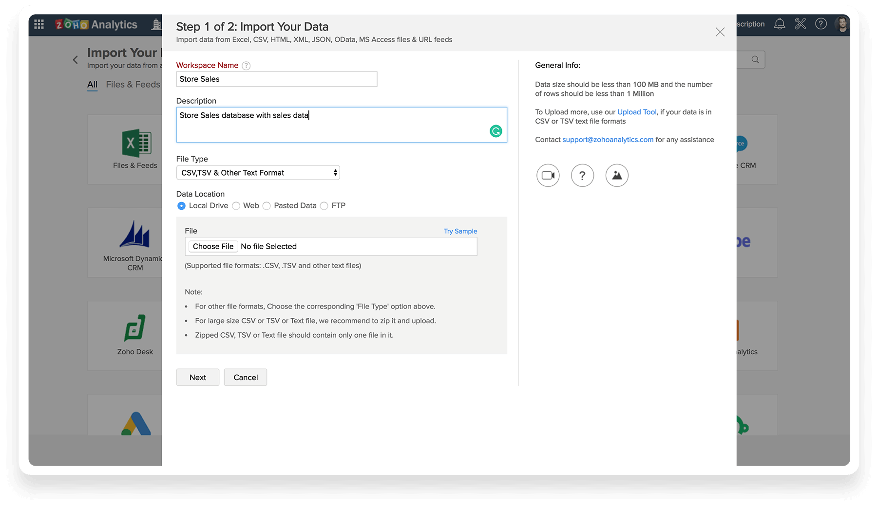
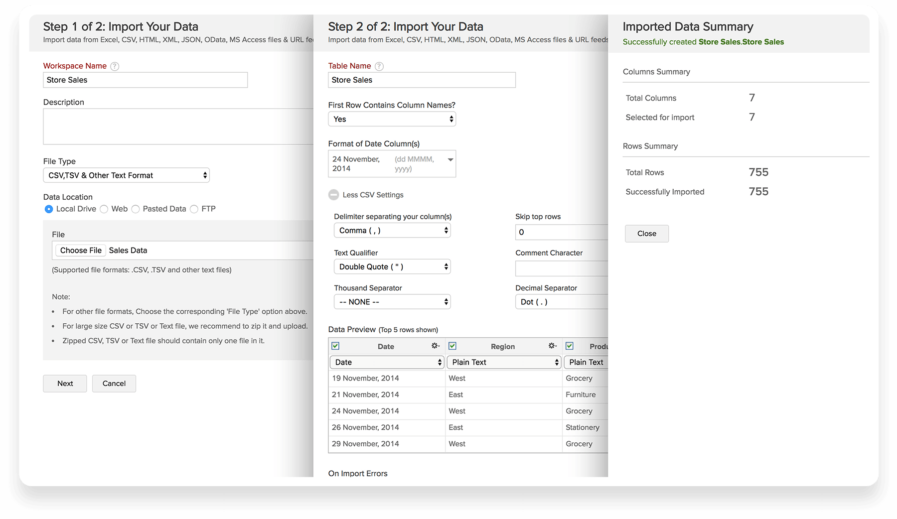
Get Data
We connect to your data and prepare it for you quickly and easily.
Data Interactive Automated Analytics connects to 500+ data sources, auto-syncs and includes data storage in our cloud
– no IT infrastructure or setup required!
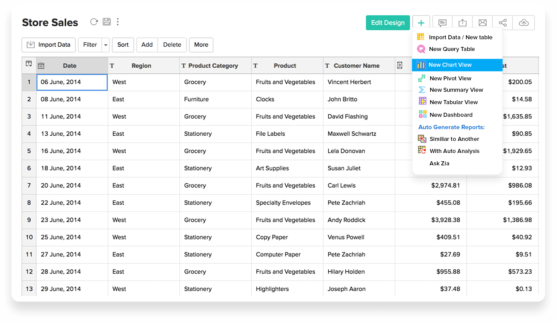
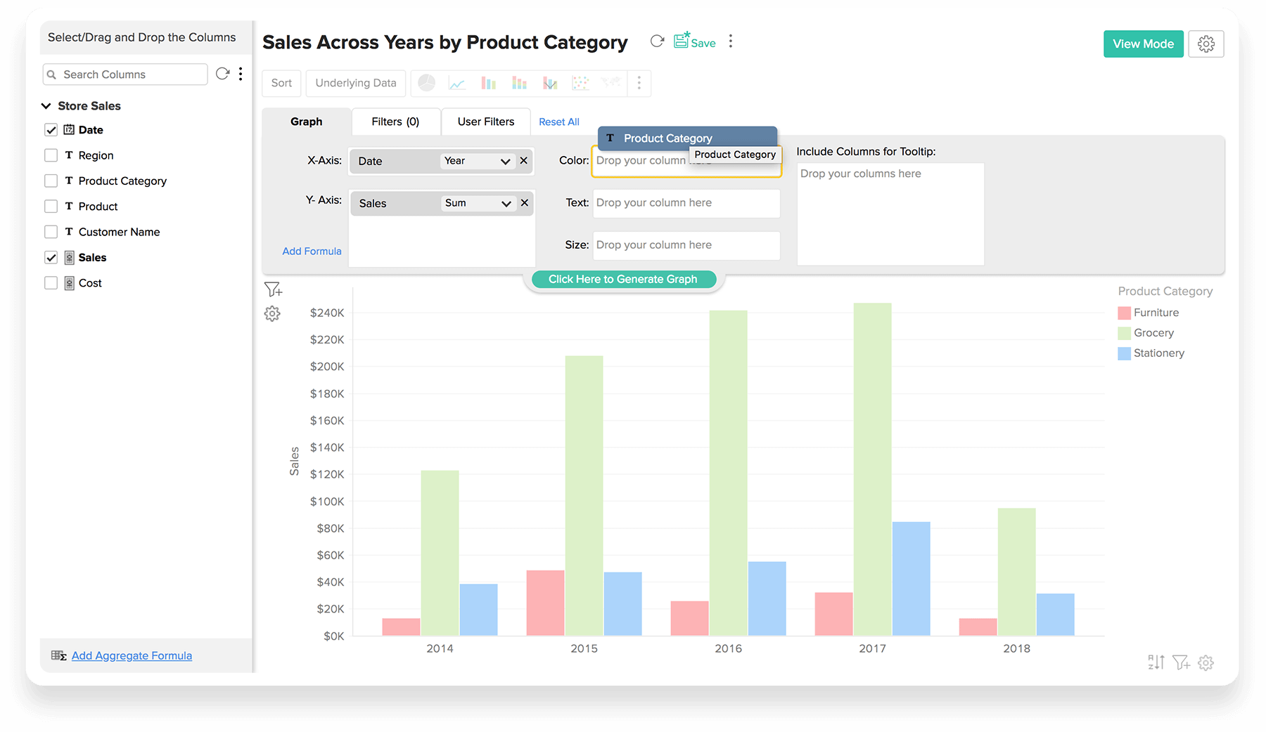
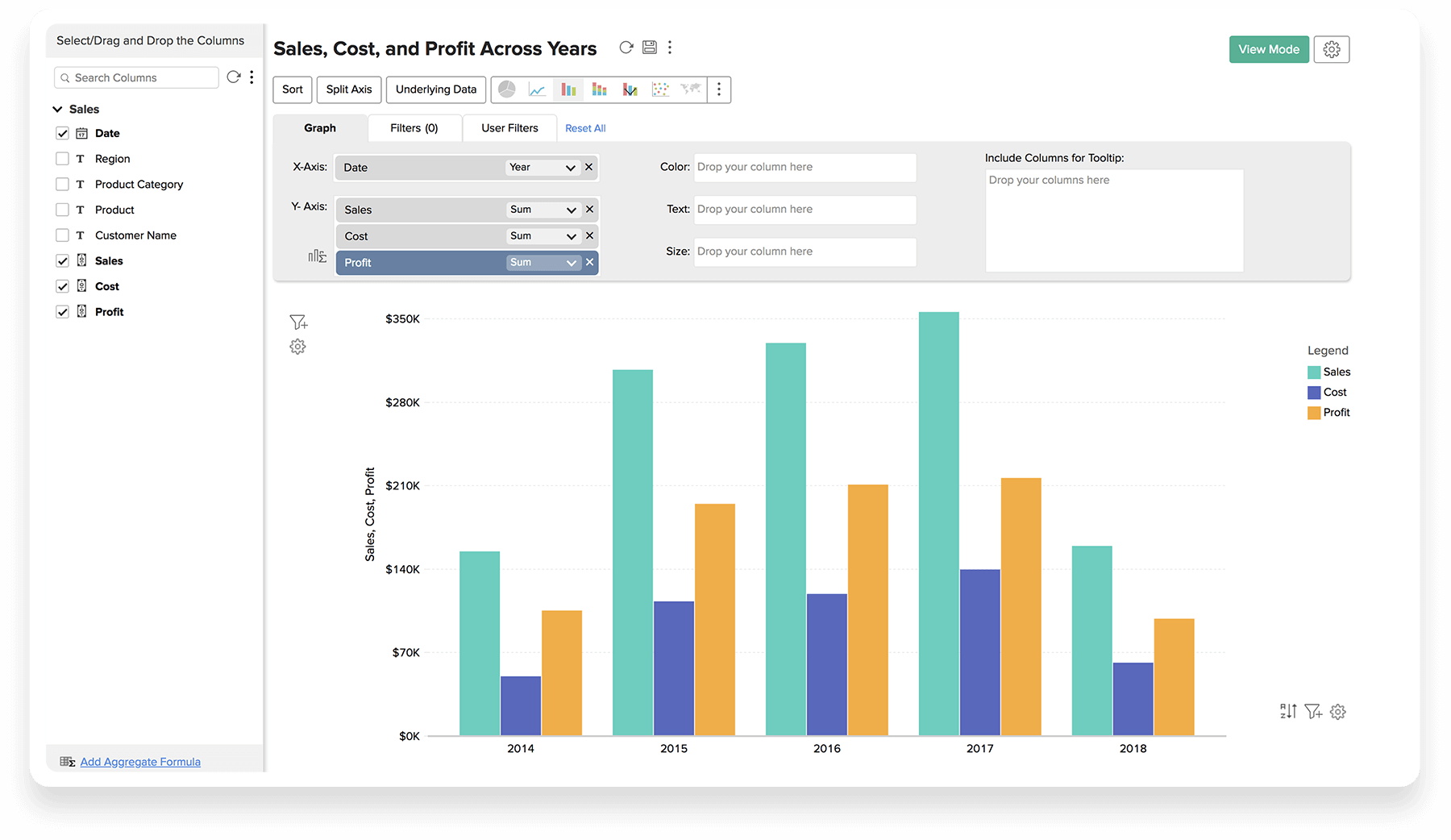
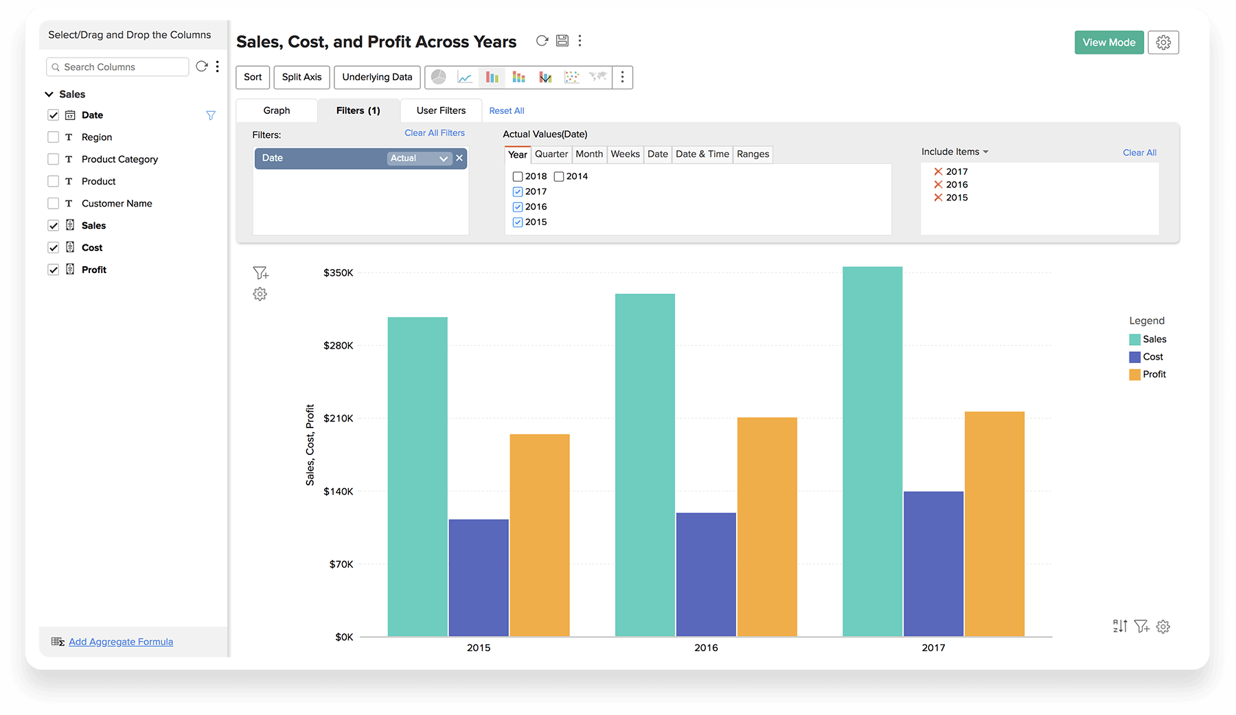
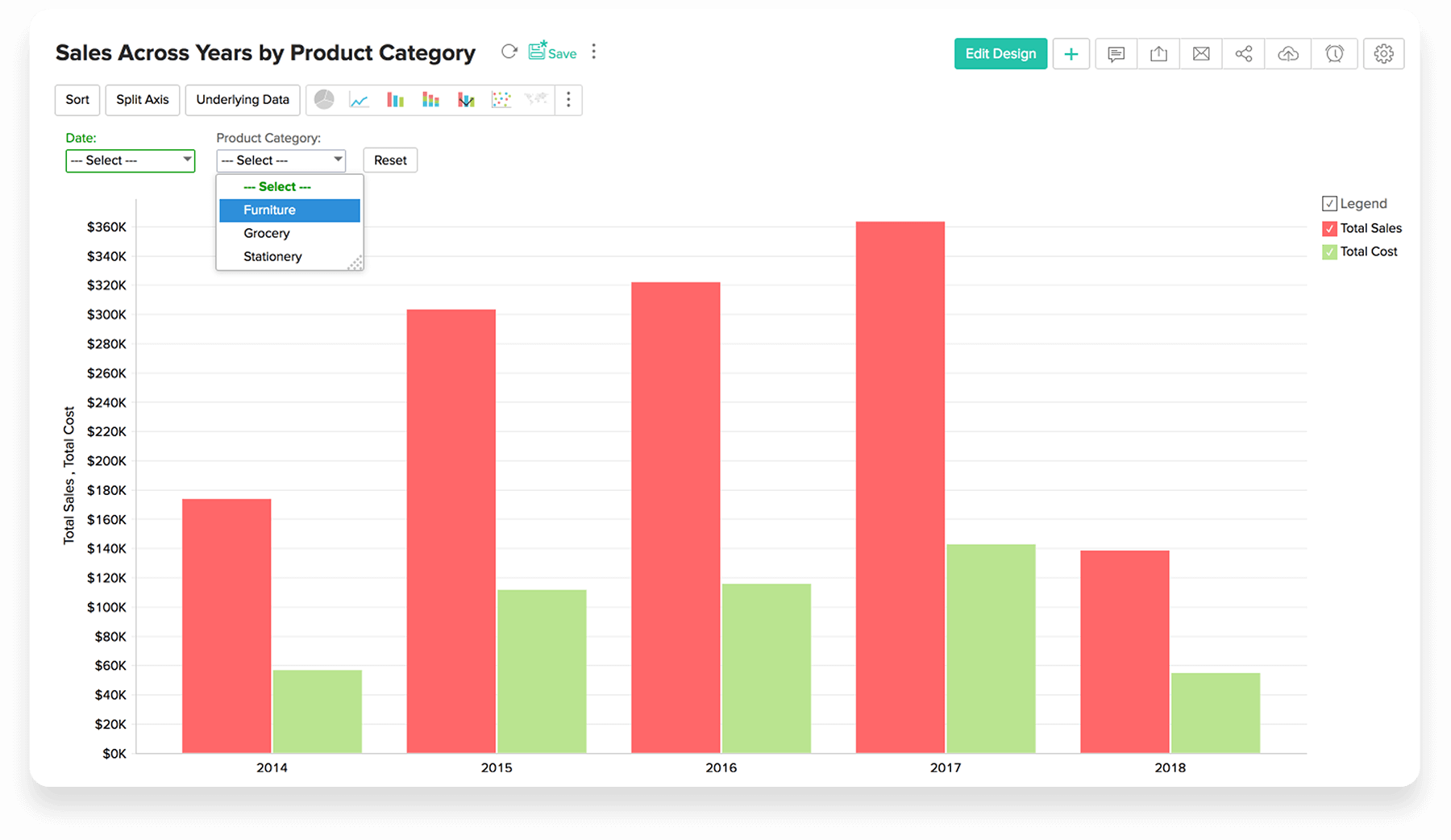
Charting
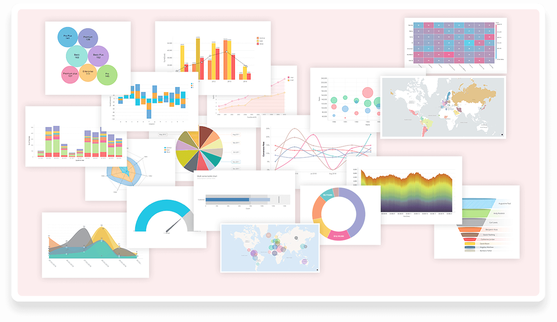
Got a preferred chart or visualisation – no worries – we have so much capability waiting for you!
Data Interactive Automated Analytics can be consumed on a DIY basis, or take the ‘made-for-you’ path
and we’ll build and maintain it for you! Hassle-free, immediate results!
- Chart Creation
- Drag & Drop
- Multiple Y - Axis
- Applying Powerful Filters
- Dynamic Filters
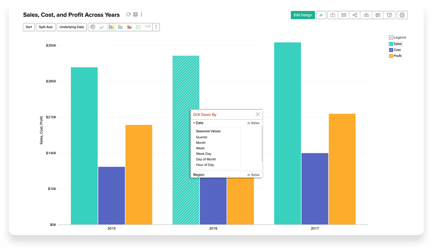
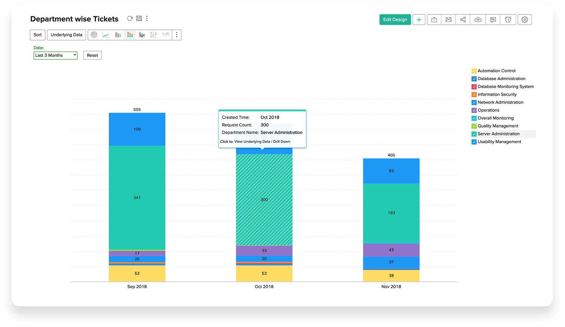
- Drill Down
- Highly Interactive
- Chart Types
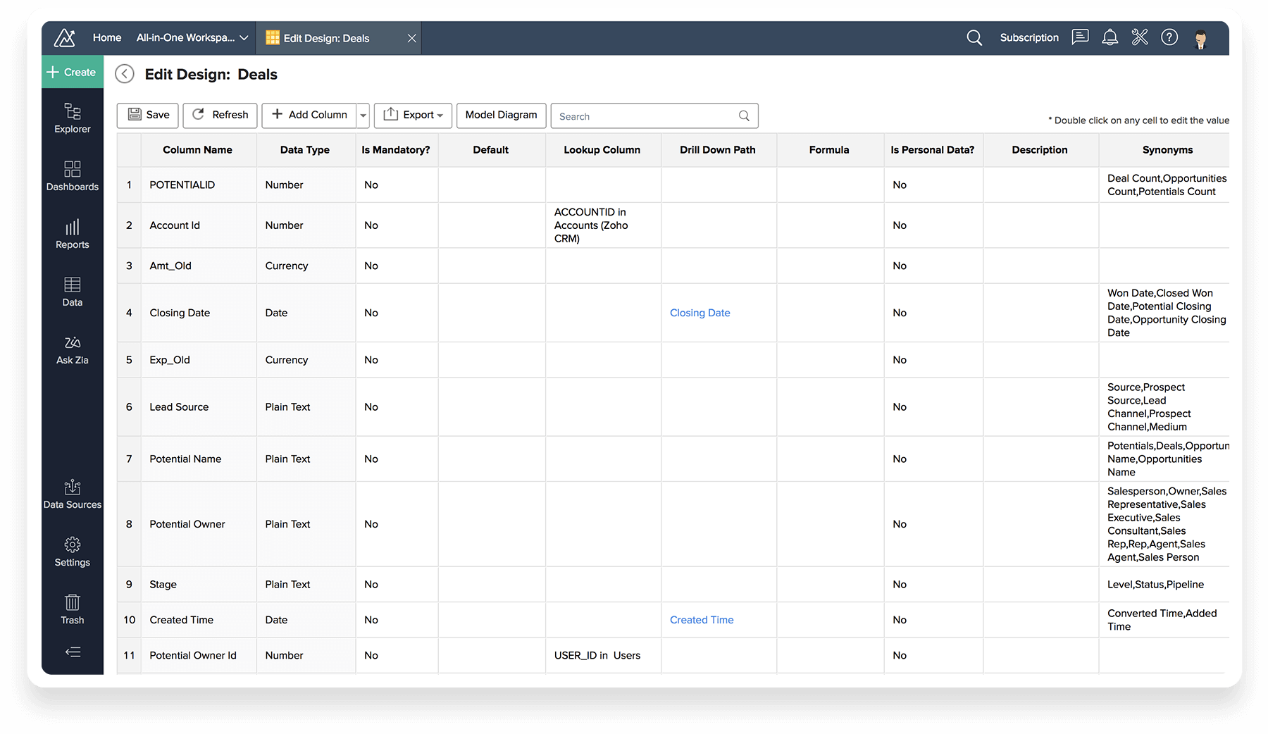
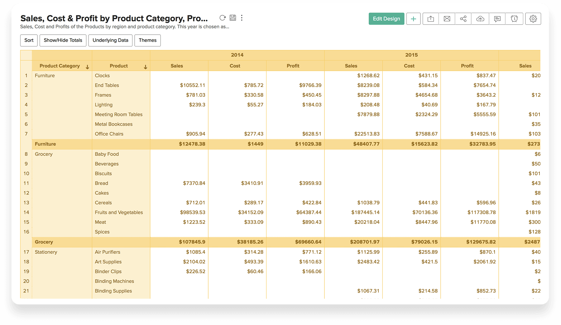
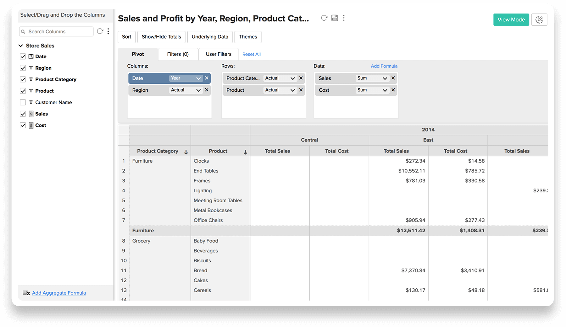
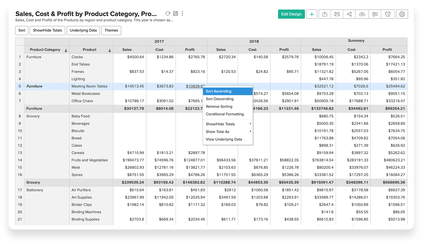
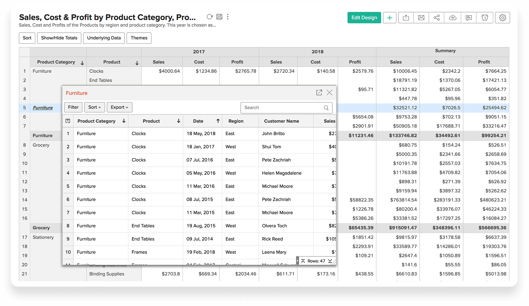
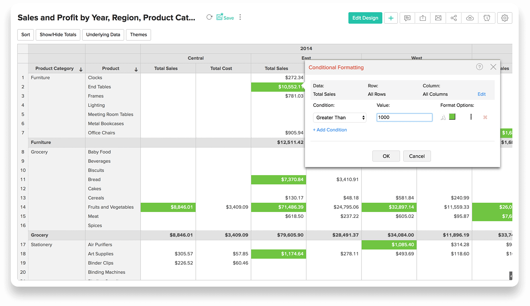
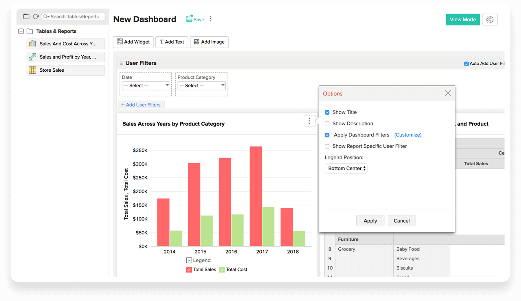
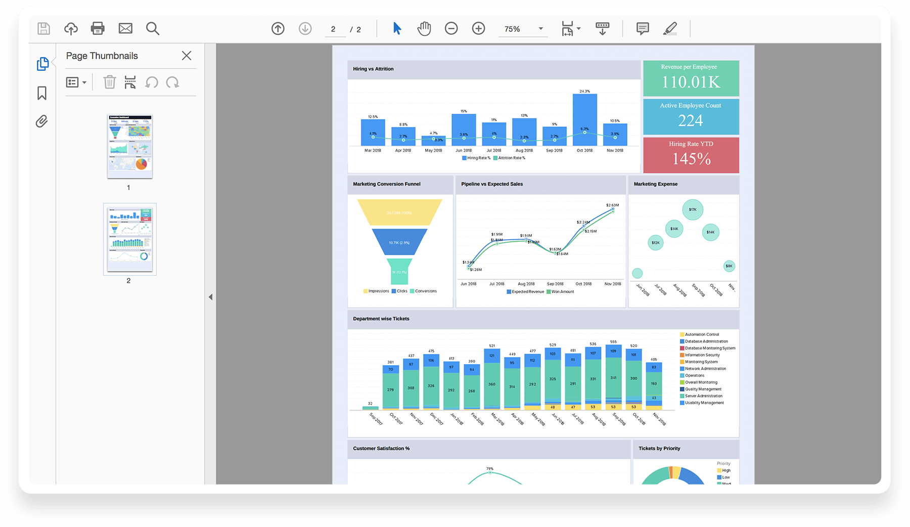
Pivot Tables
Easy to use, Easy to read, Easy to find data … Too easy!!!
Drillable, Shareable, Very insightful pivot tables make business reporting a breeze!
Data Interactive Automated Analytics meets your bespoke needs – we make software work for you not the other way around!
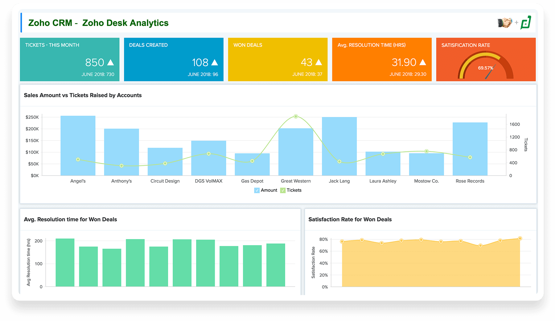
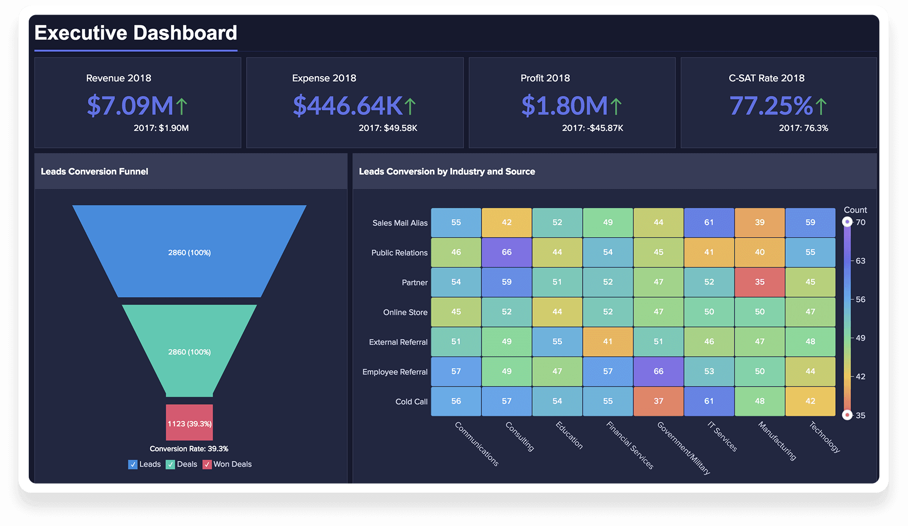
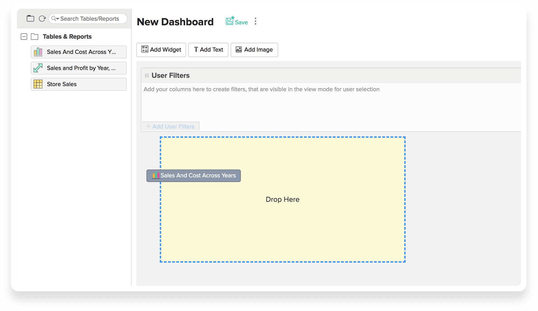
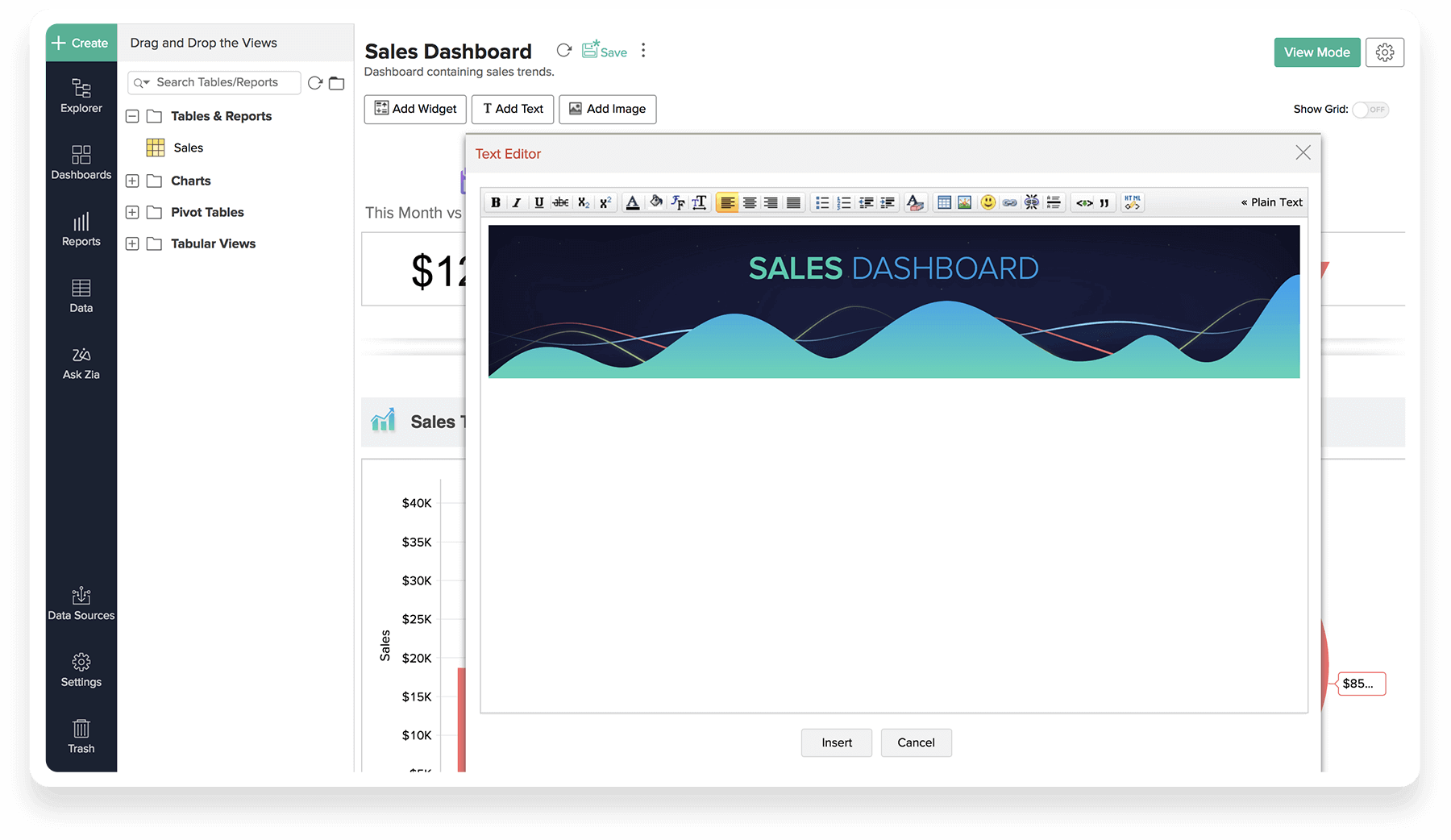
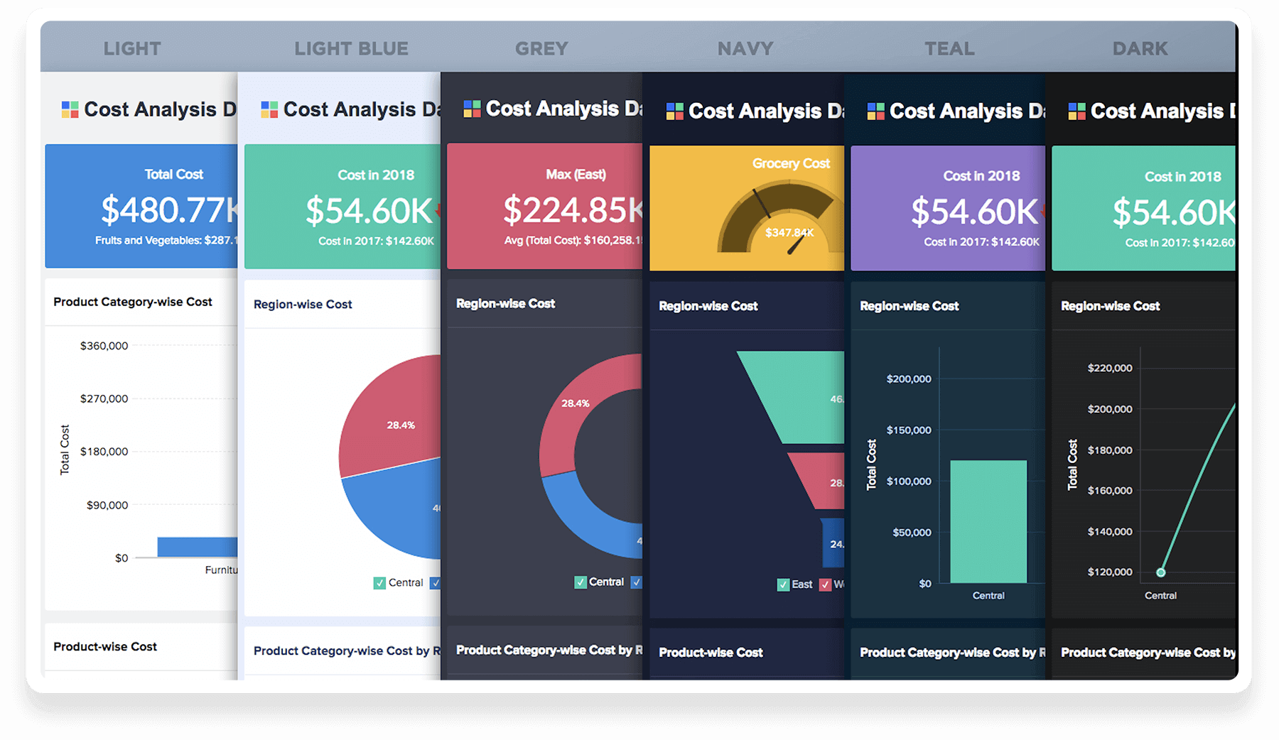
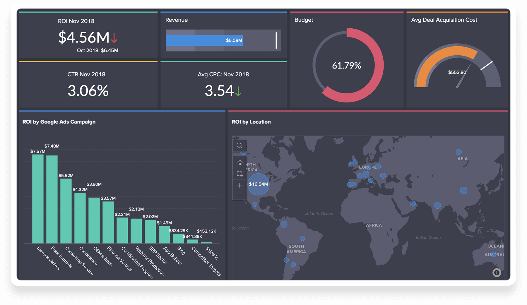
Dashboards
Need your key data in one spot, real-time, interactive and shareable online? You got it!
Data Interactive Automated Analytics delivers powerful interactive real-time Dashboards without you raising a finger!
- Dashboards
- Drag & drop
- Add Rich Formatted Text
- Flexible Layout
- Themes
- KPI Widgets
- Export, Share & Publish
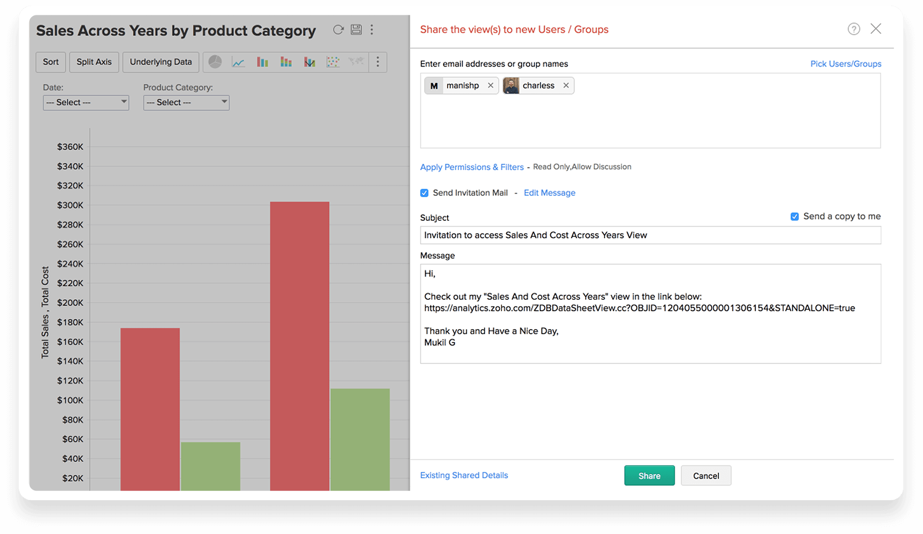
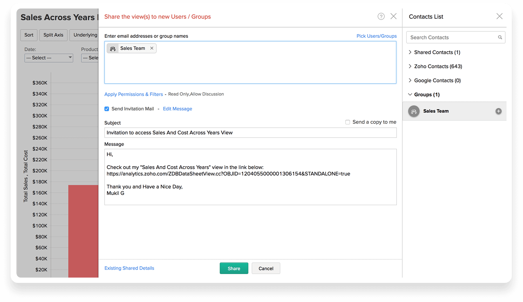
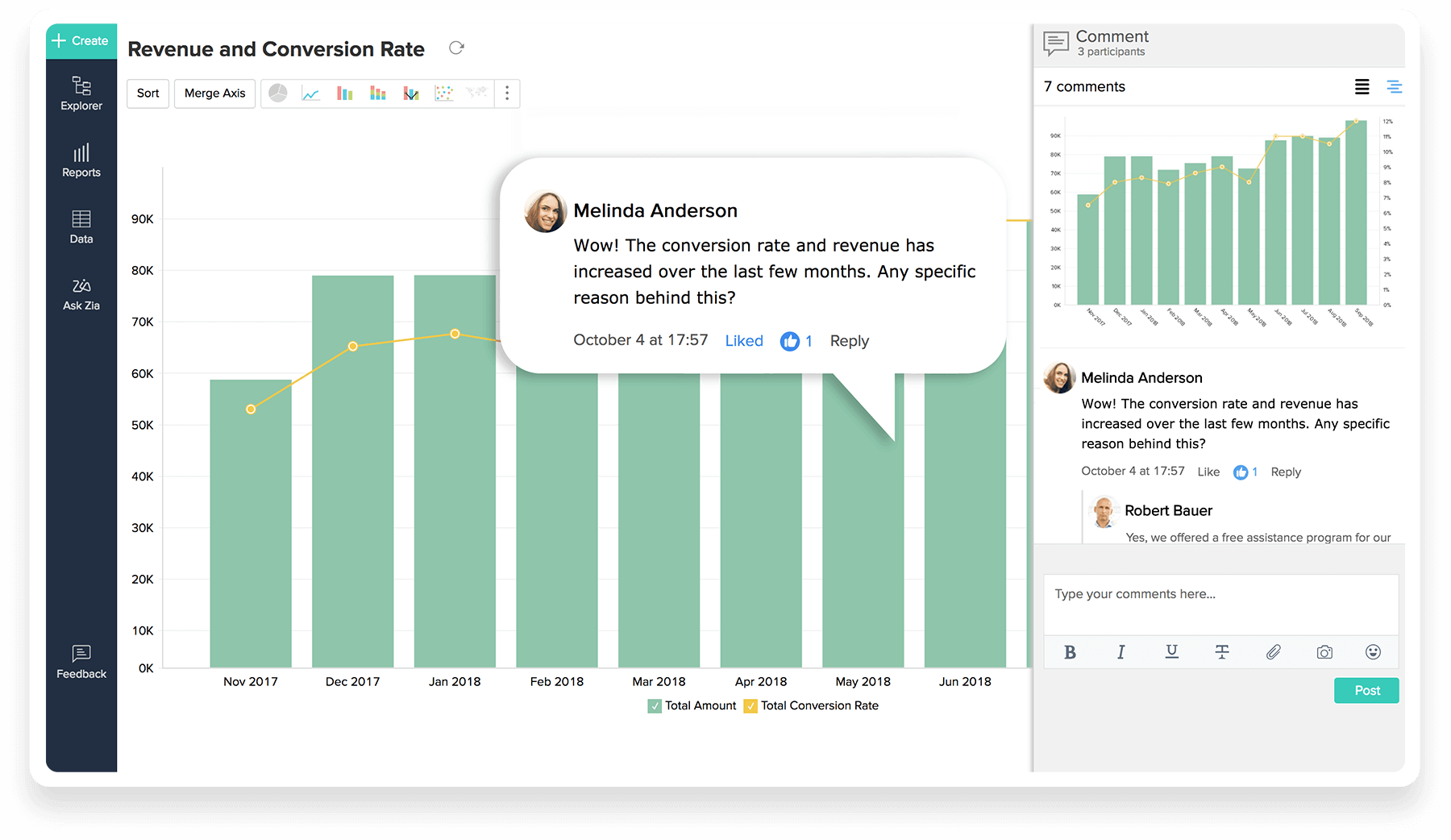
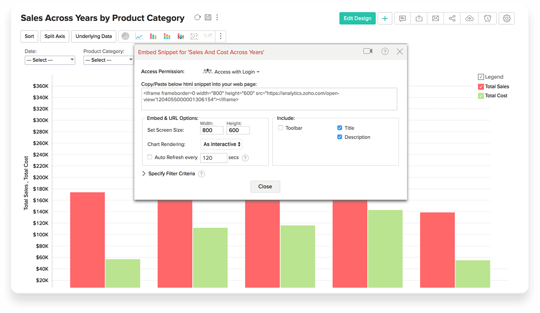
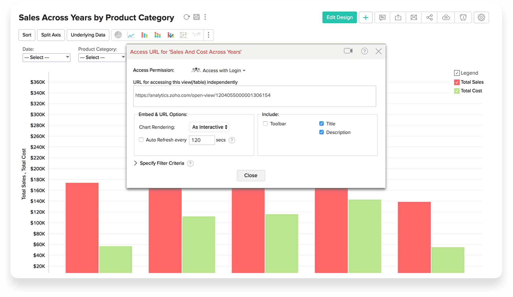
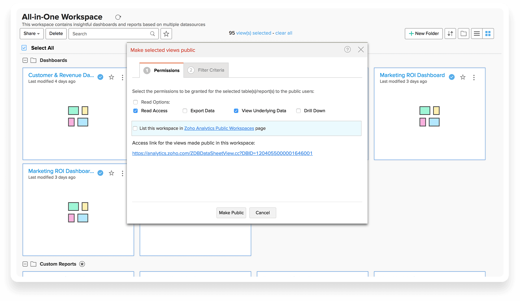
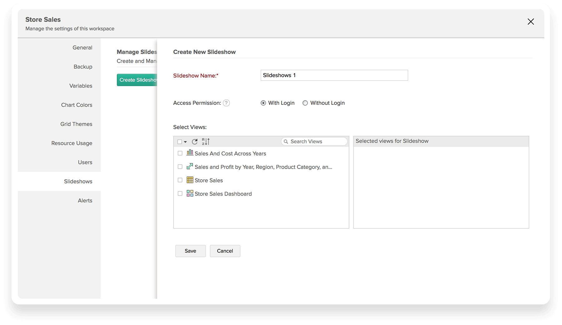
Sharing & Publishing
Forget self-service Dashboards, get Scheduled emails, real-time data alerts and central collaboration portal all in one place!
Data Interactive Automated Analytics delivers the information directly to you when you need it.